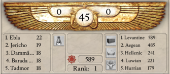
Imperator's user interface (UI) is highly moddable, but for this reason UI mods disable achievements, since a player could cheat with them.
The game also includes a powerful GUI editor, making UI modding easier to learn.
Modders can:
- change the visual style of the interface
- make windows movable and resizable
- change and remove elements
- add new buttons
- show more information from the code
Modders can’t:
- add new hotkeys (only reuse the existing ones)
- make multiple windows visible (like Treasury and Trade views at the same time)
- display information from one window in another, unless it was pre-configured by the developers
Basics
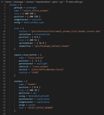
The interface in Imperator is created through .gui files in the game/gui folder, which are somewhat similar to html files.
As such, you can edit them with a notepad, but a proper text editor is recommended.
Imperator uses .dds files for textures, which are saved inside the game/gfx/ folder.
To edit or save .dds files use either Photoshop with Intel plugin or GIMP with this plugin.
Export with settings set to Alpha with no compression for better results.
There are two important console commands available for UI modding: “reload gui” and “reload texture”, for updating changes to .gui files and .dds files respectively, without restarting the game.
To use the console and the GUI editor, right-click the game on Steam, choose Properties, Set Launch Options, add "-debug_mode -develop" (without quotes).
Use this mod to hide the purple debug tooltip if it gets in the way.
Note, that using the debug mode changes the checksum, so you won’t be able to get achievements. Also, do not load any ironman saves with it, as this will corrupt them.
Creating a GUI mod
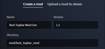
1. Start the game launcher, go to Mods, Mod Tools and fill in all the fields, including tags.
Clicking Create will create a new folder and a .mod file in Documents/Paradox Interactive/Imperator/mod.
2. Next, create a “gui” folder inside this new mod folder and copy the files you want to mod there, from game/gui.
So, to mod the topbar, we will end up with the following: best_topbar_mod/gui/ingame_topbar.gui.
- If you don’t know which file is needed, enable the mod in the launcher anyway, start the game and use the GUI editor to help locate it.
GUI Editor
GUI Editor is a developer tool for editing the UI right in the game. It is very convenient, but has its limitations and is prone to crashing.
To use it you need to launch the game with -developer and -debug_mode options.
Right-click the game on Steam, choose Properties, Set Launch Options, add "-debug_mode -develop" (without quotes).
To open the editor, either:
- press Ctrtl+F8
- open the console with the ` key (below Esc), click 2D Tools at the bottom and choose GUI Editor
- open the console, type “gui_editor” (without quotes) and press Enter.
The game will freeze when loading it for the first time, don’t be alarmed.
Features
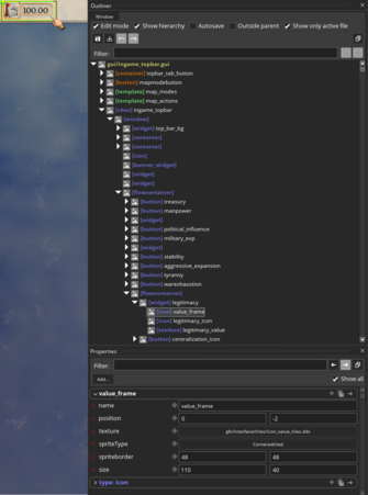
By default the editor starts with the Edit mode enabled. You can disable it in the top window, called Outliner. Hotkey “E”.
- The edit mode is similar to the Inspect mode in browsers. While it’s enabled you can’t interact with the game, but it allows you to select elements of the UI and change them in the Properties window below.
- Drag any dev windows to move it. Drag any edge to resize the window.
- Yellow border indicated the selected element. You can use the scroll wheel to switch between other elements on the screen. Uncheck “Show Hierarchy” in the Outliner to hide other borders (Hotkey “L”).
- Holding the right mouse button allows you to move the selected element. You can right-click anywhere on the screen, not necessarily on the element.
- You can drag the elements inside the Outliner to reorder them. Right-click to open the .gui file in notepad or to delete them.
- You can change or add new properties (by clicking the plus symbol) in the Properties window.
- To undo anything you can press Ctrl+Z or the undo button in the Outliner. Redo is next to it, Ctrl+Y.
- Ctrl+S saves changes to the .gui file.
By clicking "Window" in the Outliner, you can open two more windows: UI components and Registered Data Types.
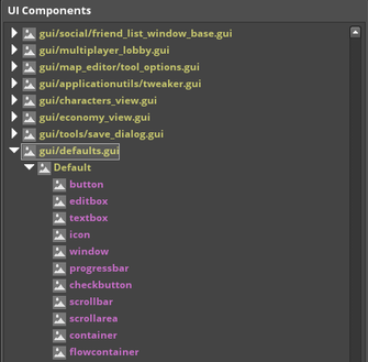
- UI Components is like a palette from which you can drag new elements to the UI. gui/shared/standard.gui and gui/defaults.gui contain the most common things, like buttons, icons and text.
- Registered Data Types may be used to look up what functions are available to display dynamic data from the game (like country stability or ruler popularity) or to duplicate some of the existing buttons.
- Clicking the top right button in the Data Types will dump this data to your log folder (Documents/Paradox Interactive/Imperator/logs). You can also use “DumpDataTypes” console command.
Important: pay attention to which .gui file is selected. It is displayed in yellow at the top of the Outliner. If you don’t have a copy of it in your mod, the editor will save changes to the game files!
If your mod is enabled, you can copy the needed files to the mod folder without restarting the game, and continue editing.
If you do accidentally change the game files, you can reset them by validating: right-click the game on Steam, go to Properties, Local Files, Verify Integrity of Game Files.
Also, it is often easy to select a template by mistake, changing which will affect all instances of it in the UI. A blue header in the Properties that starts with “Type:” indicates a template, so be careful not to edit this part, unless you intend to.
Examples
Adding the Timelapse button
Imperator has an unfinished timelapse feature that can be enabled by using the “replay” console command.
There is also a hidden button for it, which we can easily reveal.
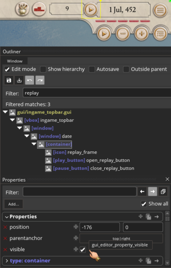
- Select the topbar and search for “replay” in the Outliner’s “filter” field. Press Enter to apply the filter.
- You should see three elements with “replay” in their names, inside a container. Select this container in the Outliner and in the Properties check the box next to “visible”.
- If you move the Outliner away from the top right corner, you should see a new button. Disable the Edit mode and click on it. The date will change to 450 and it will open the replay controls. The second button from the right will fast-forward the timelapse, so you can see how the world in your game evolved over the years.
Now, you will probably notice that you can only click on the right half of the timelapse button.
This is because the Date window is too small.
- Use the “Outside parent” option in the Outliner to highlight any elements that don’t fit inside their parents.
- Select the Date window and change its width in the Properties from 210 to 235. Now the button should be fully clickable.
Leaving it hanging in the air isn’t very pretty, however, so let’s move it to be between the date and the score.
- Select the replay container and hold the right mouse button to drag it.
- Then, let’s also remove the top half-circle, since we don’t need it here. Select the replay_frame icon. You can either:
- right-click it in the outliner and choose Delete.
- click the plus icon in the Properties and type “visible” to add a “visible” property. Unchecking that box will hide the frame but keep it in the code if we ever want to use it again.
Adding text
Let’s learn how to add new elements from the UI Components.
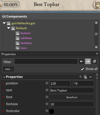
- If you don’t have this window open, click “Window” in the Outliner and select “Types” (select it again to close it). Resize the new window by dragging its bottom edge to make it easier to navigate.
- Look for gui/defaults.gui. It is the shortest line somewhere in the middle of the whole list. Expand it to reveal available components.
- Select the empty area on the topbar, between the stats and the score, topbar_bg_right. (If you still have “replay” in the filter field, delete it and press Enter to reset it)
- Drag and drop a textbox from the UI Components to the topbar. The new component is placed inside whatever element is currently selected.
- Expand the topbar_bg_right in the Outliner and select your new textbox.
- Uncheck “Show only active file” in the Outliner to see the other elements or save and then reload the UI with the “reload_gui” command.
- Go to the Properties and add a “text” property by clicking the plus sign on the white “Properties” header. Then type “text” in the search. If you don’t see this header, check “Show all” in the top right. (Do not add it to “type: textbox”, as this section is for the template, located in gui/defaults.gui)
- You should see your text appear in pink letters on the topbar. To make it look better, we will need to add a few more properties: “font” (choose BaseFont), “fontcolor” and “fontsize”. Add “autoresize” and enable it by checking the box so you can select the textbox from the UI. Otherwise, it won’t actually have any size.
- if you need to add a lot of text, you could edit the blue template section, but then you’ll need to include the defaults.gui file in your mod and this may cause incompatibility issues with other mods. The better way to do it is by manually copying textboxes in the .gui file.
Adding more stats
Let’s say we want to show more information on the topbar, like the ruler’s wealth and popularity.
The topbar stats are placed inside a flowcontainer which automatically orders them in a row, so we don't need to set position for each one.
- Select one of the stats on the topbar and find its parent flowcontainer in the Outliner.
- You can see there are two flowcontainers: one for all the stats and one inside it for legitimacy and centralization. You can select either one, our stats will be added at the very end.
- With the flowcontainer selected, drag an icon from the UI Components. You can drop it anywhere, as the flowcontainer ignores position. The template for the icon is in gui/defaults.gui, like for the textbox. (To open the UI Components, click Window>Types in the Outliner)
- Expand the flowcontainer in the Outliner and select your new icon. Add a “texture” property in the Properties. (Enable “Show all” if you don’t see the white Properties header. Do not add it to “type: icon”.)
- For now we will not add a frame like the other stats have, as it’s somewhat tedious. Instead, search for “treasury” in the “texture” field and select the first result.
- Add the “size” property and set it to 35x35 or the “scale” property set to 0.75.
- Next, select the flowcontainer again and add drag a textbox.
- Select the textbox in the Outliner and add a “text” property.
- Click on the plus sign next to the text property and select the following cascading menus: Player > Get Ruler > GetWealth. GetWealth will be in white and you need to scroll down for it.
- This will display the ruler’s current wealth in pink numbers on the topbar. To remove the fractional numbers, add “|0” the text field like this:
[Player.GetRuler.GetWealth|0]. This doesn’t round the numbers, just cuts it off, but it will be enough for us. “|1” will display 1 digit after the decimal, “|2” will two and so on. - Add the “font”, “fontsize”, “fontcolor” and “size” properties. Set the font to BaseFont, the fontsize to 18 and the size to 30x30, as this will line it up properly with the other numbers.
- To add some spacing between our icon and text, select the flowcontainer and add a widget to it from the UI Components. Then reorder it in the Outliner to be between the icon and text.
- Add a “size” property to the widget and set its width to 10. If you want to add more space before the icon too, add another widget there.
- To add the ruler’s popularity we can try to recreate how vanilla stats look. You can select one of them and try to do it yourself.
- Select the flowcontainer and add a widget to it, add a “size” property set to 116x40. We won’t be using a button as we can’t add the “onclick” property in the editor and, as such, tell it what to open.
- Select the widget and add an icon. Search for the “icon_value_tiles” texture.
- Set the icon’s position to 0x-2 and size to 110x40.
- The texture will look slightly different, so add a “spriteType” property set to corneredtiled and a “spriteborder” set to 48x48. This allows the texture to be stretched, while preserving its edges (spriteborder determines how much to preserve). Experiment by changing the icon’s size.
- Add another icon to this widget, search for a “popularity” texture and set its position to 2x0.
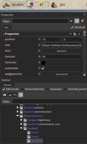
- Select the widget and add a textbox to it, set “text” to
[Player.GetRuler.GetPopularity|0]. You can copy and paste this instead of searching, as GetPopularity is buried deep in the list.- You can also use InGameTopbar.GetPlayer.GetRuler… like other stats do. Each window has its own set of promotes available to it, which you can see in DataTypes. However, there is a set of global promotes that can be used anywhere, like Player.
- Set the textbox’s position to 73x3, add “autoresize” and enable it and add a “widgetanchor” property set to top|hcenter. Widgetanchor determines where the object’s anchor point is (displayed by a yellow dot), which is what we move around when changing position. By default it’s always set to top|left.
The advantage of the second method is we can drag our widget in the Outliner and place it between other stats.
However, this is where you see the limitations of the editor, as we cannot copy elements and their properties or add functioning buttons.
Manual editing
Every .gui file can be edited manually with a text editor. They are stored in the game/gui folder.
We can change the structure of any file and preserve functionality, unlike in Stellaris.
It is possible to create new .gui files to store templates, but they won’t add new windows. Instead, any new menus will have to be displayed inside one of the game’s windows.
“Important”: editing manually is very likely to cause the GUI editor to crash, so choose one or the other method.
“Tip”: mute the game when modding the UI, as using the “reload gui” command triggers a loud sound every time, and it doesn’t seem like we can mod it out.
When the console is open, you can press the “up” key to bring the last command, instead of typing “reload gui” every time. If you’re familiar with AutoHotkey, add a shortcut that opens the console and enters the command for you, as you will be using it very often.
Basics
Imperator’s UI is made out of containers and objects within them.
Most windows, for example, are created using the “window” container, while map icons use a widget or an hbox.
Every element is opened and closed with curly brackets, like this: container = { }.
The common code style is to opening and close the block on the same level, while indenting the contents with one tab:
icon = {
    using = icon_popularity
    scale = 0.7
}
This helps you see the structure of the code better, notice any missing or extra brackets, and is needed for some editors to correctly fold the blocks of code (by pressing an arrow or a plus sign on the left column).
The order in the file determines the order the elements appear on the screen: what’s below in the code will appear on top.
Most elements can also contain others, for example, you may put an icon inside a button and a textbox inside an icon. Child elements – those inside others – will have their position set relative to the parent and will be moved with them.
If one button is inside another, it will also be highlighted when hovering over the parent.
Data types
Each window has a predefined set of functions available for it. These can be found in the data_types.log file in Documents/Paradox Interactive/Imperator/logs/ after you use the “DumpDataTypes” console command.
These functions are used to display dynamic data about the game, like your treasury or the number of pops, and for buttons.
A function from one window cannot be used in another, for example, GetPossibleBuildings cannot be used to create a building menu in the province_view.gui, like before the 1.2 patch.
We can also chain functions like this:
text = “[ViewPopsWindow.GetProvince.GetPopActivity('growing_pop').GetPop.GetCulture.GetName]”
In plain English, this line in the Pop View looks up the current province, then the pop growing in it and displays the name of its culture.
To use a window-specific function, you must start the line with that window’s promote, e.g. ViewsPopsWindow or InGameTopbar.
We can also use global promotes and functions, like Player or GetChristianDateString. Player allows you to get information on the player’s country from any window, so you could show how much gold the player has in any window they may spend it, with this line:
text = “[Player.GetTreasury]”
In addition, sometimes “datamodel” or “datacontext” are used to point to an item or a character and then all the child elements start their functions from that promote, like here:
datamodel = "[GovernmentView.GetOfficeHolders]"
…
text = "[OfficeHolderItem.GetName]"
tooltip = "[OfficeHolderItem.GetNameDesc]"
This is especially useful with templates which are used across multiple windows, and we only need to change the datacontext of the parent.
Examples
Changing the date to BC
A common request from the players was to display the date in our Gregorian calendar.
To do this, open the ingame_topbar.gui, search for “CURRENT_DATE” and replace it with “[GetChristianDateString]”.
The vanilla file points to a localization entry, in game/localization folder, but if you search for “CURRENT_DATE” there, you’ll see that it simply translates to "[GetDateString]" for every language. As such, we can safely put a function in the .gui file. The text will change automatically for different languages (you can test this by opening the console, clicking Languages at the bottom and switching to other languages at the top).
You will notice that this string is longer and doesn’t always fit within the frame. To fix this, change the width of the icon called “date_frame” to 160 (right above it in the file). Then, also change the x position of “date_text” textbox to -60 to align it properly.
Alternatively, you can remove “date_frame” altogether.
Of course, it would be nice to allow the player to switch between the two dates. For this we need PdxGuiWidget.
Adding toggles with PdxGuiWidget
PdxGuiWidget is a function used to hide or reveal named elements.
The basic structure is this: two buttons, one of which is hidden, and the hidden element we want to reveal.
- when clicked, the first button goes back to its parent, searches in it for the named element and the other button, reveals them and hides itself
- the second button searches for the element and the button, reveals them and hides itself
 container = {
   button = {
     name = "show submenu"

     onclick = "[PdxGuiWidget.AccessParent.FindChild('submnenu').Show]"
     onclick = "[PdxGuiWidget.AccessParent.FindChild('hide submenu').Show]"
     onclick = "[PdxGuiWidget.Hide]"
   }

   button = {
     name = "hide submenu"
     visible = no

     onclick = "[PdxGuiWidget.AccessParent.FindChild('submnenu').Hide]"
     onclick = "[PdxGuiWidget.AccessParent.FindChild('show submenu').Show]"
     onclick = "[PdxGuiWidget.Hide]"
   }

   widget = {
     name = "submenu"
     visible = no
   }
 }
If the elements are separated by more parents/children, we can repeat AccessParent like this:
onclick = "[PdxGuiWidget.AccessParent.AccessParent.AccessParent.AccessParent.FindChild('submnenu').Show]"
Each button can hide or reveal multiple elements of any type. You only need to provide the name.
For an example in search for provinces_in_state in the province_window.gui.
The advantage of this method is it's easy to edit on the fly as any changes can be reloaded with the 'reload gui' command
The downsides:
- the toggles will reset any time the game is restarted
- Ii you want to hide multiple things or toggles, the code will get very bloated and hard to manage
- trying to hide entries in a data list (like a dynamicgridbox) will only hide the first instance
Adding toggles with Scripted GUIs
This is the alternative method. A more detailed explanation of scripted guis is below.
For a scripted toggle we would need to create a .txt file in common/scripted_guis/. The name of the file doesn't matter.
A basic toggle in this file would looks like this:
 gui_toggle = {
   scope = country

   ai_is_valid = {
     always = no
   }

   is_shown = {
     has_variable = gui_toggle
   }

   effect = {
     if = {
       limit = {
         has_variable = gui_toggle
       }
       remove_variable = gui_toggle
     }
     else = {
       set_variable = gui_toggle
     }
   }
 }
When clicked, it adds a variable to the selected country, and when clicked again it removes it.
If the variable is present, our element is visible. If it's not, it's hidden.
This is how the gui file would look like. We can use just one button as its function will change with each click.
 button = {
   datacontext = "[GetScriptedGui('gui_toggle')]"
   onclick = "[ScriptedGui.Execute( GuiScope.SetRoot( Player.MakeScope ).End )]"
 }
 widget = {
   datacontext = "[GetScriptedGui('gui_toggle')]"
   visible = "[ScriptedGui.IsShown( GuiScope.SetRoot( Player.MakeScope ).End )]"
 }
"Player' is a global promote and links to the player country, so we can use it in any window.
'Player.MakeScope' makes the country the scope of the scripted gui, meaning that's who we add the variable to.
Two buttons can be used if you want different tooltips. In this case, copy the 'visible' property to both, but add 'Not' to one of them, so it's hidden by default.
visible = "[Not(ScriptedGui.IsShown( GuiScope.SetRoot( Player.MakeScope ).End ))]"
The advantages of this method:
- the toggles are saved and won't reset unless you start a new game
- can be used to hide elements depending on other conditions: if the player has 100 gold, is at war, is a tribe, etc
- it's easier to hide and reveal multiple elements at the same time
- it's easy to move elements in the code, no need for multiple 'AccessParent's
The downsides:
- you need to restart the game to update scripted guis
- it's harder to remember the syntax (it may be easier to copy the code to reduce the chance of mistakes)
Scripted GUIs
Scripted guis are, essentially, hidden events triggered from the UI.
The are stored as .txt files in game/common/scripted_guis and cannot be reloaded from the game, unlike the .gui files.
The basic structure of a scripted gui is:
gui_name = {
    scope = country 		# the root scope, i.e. the target of the effects
    saved_scopes = {} 		# any additional targets

    is_shown = {} 		# when is it visible on the UI?

    ai_is_valid = {} 		# is the AI allowed to use it?

    is_valid = {} 		# when can the player use it?

    effect = {			# what it actually does
        custom_tooltip = ""	# adds a tooltip
    }
}
Not all of the blocks are necessary. Sometimes a scripted gui may only contain the scope and is_shown if we're using it to hide an element based on some condition in the code.
The scope will change depending on the scripted gui. If it applies to a character, it will be scope = character.
In the .gui files we use datacontext = "[GetScriptedGui('gui_name')]" to link our button or element to it and the following for various effects:
onclick = "[ScriptedGui.Execute( GuiScope.SetRoot( Player.MakeScope ).End )]"
On clicking the button, Execute will apply the effects from the effect block to the player country, which is set as the root scope.
It is important to not put any spaces before the dots or opening parentheses! Execute( is correct, Execute ( is not. Other spaces can be omitted, but they help with readability.
visible = "[ScriptedGui.IsShown( GuiScope.SetRoot( Player.MakeScope ).End )]"
IsShown will hide or show the button, based on the conditions in the is_shown block.
enabled = "[ScriptedGui.IsValid( GuiScope.SetRoot( ProvinceWindow.GetState.MakeScope ).End )]"
IsValid will disable the button based on the conditions in the is_valid block. This is an example of the Military Investment button on the province view, which scopes to the province (provinces are called "states" in the code).
tooltip = "[ScriptedGui.BuildTooltip( GuiScope.SetRoot( CharacterWindow.GetCharacter.MakeScope ).AddScope('player', Player.MakeScope ).End )]"
BuildTooltip will create a tooltip from the custom_tooltip in the effect block. In this example of the Assist Scheme button in the character view, the root scope is set to the character and the player country is saved as a second scope named "player". The name here can be anything.
Adding a gold button
Let's say we want a button that gives us 100 gold. We'll put it on the topbar.
We'll write the scripted gui first, since we can't load it after the game is launched
- Create a
game/common/scripted_guispath in your mod folder and create a .txt file with any unique name, e.g. cheat_buttons.txt - Add the following:
 gold_button = {
   scope = country

   ai_is_valid = {
     always = no
   }

   effect = {
     add_treasury = 100
   }
 }
We choose "country" as our scope, since we'll be giving gold to the country. We disable it for the AI and add 100 gold in the effect block. You can the list of potential effects here, or in effects.txt in your log folder.
- Now we'll add a button and launch the game.
- We can copy the ledger button with its container, move it to -400 and replace the icon's
texture = ""withusing = icon_treasury. - Next, link the button to our sgui by adding
datacontext = "[GetScriptedGui('gold_button')]". We use the name of the scripted gui here, not the file! - Change onclick to this:
onclick = "[ScriptedGui.Execute( GuiScope.SetRoot( Player.MakeScope ).End )]" - Add
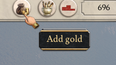
tooltip = "#t Add gold"
Now clicking the button should give us 100 gold.
For troubleshooting, check your error.log in the log folder.
Adding a gift button
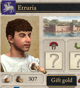
Let's say we want to give 100 gold to another country. And make the player lose 100 gold.
We can put our button in the Diplomacy window (diplomatic_view.gui) and use GetTargetCountry as our root scope and Player as a second saved scope, let's call it "gifter".
The script will look like this:
 gift_button = {
   scope = country
   saved_scopes = {
     gifter
   }

   ai_is_valid = {
     always = no
   }

   is_valid = {
     scope:gifter = {
       treasury > 100
     }
   }

   effect = {
     add_treasury = 100
     scope:gifter = {
       add_treasury = -100
     }
   }
 }
As you can see, in is_valid we switch to our saved scope with scope:gifter and then check if the player has more than 100 gold.
In the effect we do the same, switch scopes and add -100, which subtracts it from the treasury.
Next, let's add the button.
- Copy diplomatic_view.gui to your mod folder and search for player_portrait. You want the second one, on the line 1027, as the first portrait is for barbarians.
- Copy your modified ledger button, without the container, and paste it below the portrait. Add
position = { 90 195 }, so it's right above the treasury. - Change datacontext to link to gift_button.
- Change onclick to
"[ScriptedGui.Execute( GuiScope.SetRoot( DiplomaticView.GetTargetCountry.MakeScope ).AddScope('gifter', Player.MakeScope ).End )]" - Add
enabled = "[ScriptedGui.IsValid( GuiScope.SetRoot( DiplomaticView.GetTargetCountry.MakeScope ).AddScope('gifter', Player.MakeScope ).End )]" - Change to tooltop to "#t Gift gold"
And now it should work! Use the "cash" console command to give yourself gold to test it.
If we don't want the button to be visible when opening our country, we can add is_shown = { is_ai = yes }.
Then we'll also add to the .gui:
visible = "[ScriptedGui.IsShown( GuiScope.SetRoot( DiplomaticView.GetTargetCountry.MakeScope ).AddScope('gifter', Player.MakeScope ).End )]"
So it will only be visible if the target country is an AI.
Adding toggles
Displaying a variable or script value
To show a variable on the UI is quite simple by using the Var function.
Example:
text = "[ProvinceWindow.GetProvince.MakeScope.Var('religious_prestige').GetValue|0]"
Where religious_prestige is a variable stored on the province currently selected. Any other appropriate scope can be used such as a country variable with:
text = "[Player.MakeScope.Var('religious_centralization').GetValue|0]"
To display a script value use this:
text = "[GuiScope.SetRoot(Player.MakeScope).ScriptValue('tribal_unity')|0]"
This variable function can also be utilized in a localization entry. Example:
REL_PRESTIGE_CITIZEN_TT:0 "Citizen: #G +[SCOPE.GetRootScope.GetProvince.MakeScope.Var('citizen_num').GetValue|2]#!"
Where the scope comes from the top scope in the gui file. (i.e. scope = country, scope = province etc)
You can also use a saved scope as the target. You save a scope with "save_scope_as = target_religion". Example:
TOTAL_PRESTIGE_DISPLAY:0 "[SCOPE.sP('target_religion').MakeScope.Var('total_prestige').GetValue|0]"
But this localization string has to be called from the scripted GUI file with:
custom_tooltip = "TOTAL_PRESTIGE_DISPLAY"
And then using the BuildTooltip function:
text = "1. [ScriptedGui.BuildTooltip(GuiScope.SetRoot(Player.MakeScope).End)]"
In a localization file you can also show script values. Example:
[SCOPE.ScriptValue('final_cen_change_svalue_UI')|+=2]
This system is very flexible and the strings created can be displayed in texts right on the screen or as a tooltip where you just write "tooltip" instead of "text". Can also have great control over what appears in a tooltip by simply using a if and a limit with a custom_tooltip inside it.
Some more examples that might be helpful:
[SCOPE.sP('targetprov').GetName]
[SCOPE.sChar('prevruler').GetName|Y]
Displaying data lists
Hiding an object
UI components
Containers
Data lists
Objects
Templates
Templates are named blocks of code which can be used multiple times throughout the code. Editing the template will edit all instances of it.
Templates are global and can be defined in any file. A local version, local_template, has to be defined within the same file. Templates can store the contents of an entire window or just one line, like this one:
template MarbleFontColor
{
 fontcolor = { 0 0 0 1 }
}
This template can be used inside another element with “using = MarbleFontColor”, which will, essentially, replace the “using” line with the contents of the template. In this case, it should be used inside a textbox.
Types
Whereas templates can contain just a few parameters, types are always whole elements, like a button or a widget.
A commonly used type is DefaultHeaderBackground in gui/shared/standard.gui, which is a widget, containing a black background, a frame icon and a textbox. It is then used like any other element by adding DefaultHeaderBackground = { }.
Types are defined in a slightly different way, by creating a named group of types first:
types Standard_Types
{
    type DefaultHeaderBackground = widget {
    ....
    }
}
Blockoverride
Templates and types can have named override blocks, which allow us to edit a part of an instance without changing the whole template. DefaultHeaderBackground includes a block for text:
block "text"
{
    text = "REPLACE_THIS_TEXT"
}
To replace it, we add a blockoverride with the same name in our instance:
blockoverride "text"
{
    text = "POPS_TITLE_PWINDOW"
}
Some files, like reorg_window.gui, the Create New Unit window, use blockoverrides extensively, to create both parts of the interface.
Textures
Resources
| 文档 | 效果指令 • 触发条件 • 修正列表 • 作用域 • 变量 • 数据类型 • 本地化 • 可自定义的本地化 |
| 脚本 | AI • 建筑 • 宣战理由 • 人物 • 人物互动 • 战术 • 国家 • 文化 • 决议 • Defines • 经济政策 • 事件 • 渊源 • 政府 • 总督政策 • 理念 • 修正 • 军事传统 • 官职 • 行动 • 派系 • 价格 • 人口 • 宗教 • 省份 • Script Values • Scripted Modifiers • 附属国类型 • 科技 • 商品 • 特质 • 单位 |
| 地图 | 地图 • 地形 • 地图定位器 |
| 图形 | 3D模型 • 界面 • 盾徽 • 图形资产 • 字体 • 粒子效果 • 着色器 • 单位模型 |
| 音频 | 音乐 • 音效 |
| 其他 | 控制台命令 • 校验和 • 模组结构 • 错误调试 |
